Tuesday, June 28, 2016

EXP3 Final Submission

BRIDGE - School of Architecture

Sketchup and Lumion


Link to Sketchup File

Link to Lumion Files
https://drive.google.com/folderview?id=0BxWxz42XkMRpVW1iZ0cwOXlWR1U&usp=sharing

Image Captures


Moving Elements 


The roof of the lecture theatre opens according to the angle of the sun in order to let in natural light. The video shows a comparison of the lecture theatre interior with and without the roof opened.
Users are also able to manually control the amount of light let into the theatre, which is useful for when different areas of the theatre are used for different purposes i.e. seating area not too bright so laptops can be seen


Whilst the Computer Lab / Studio Space is intended for fully flexible use, platforms which can be elevated are intended exclusively for studio sessions or meeting areas in order to create privacy.
Users have full control over whether they want the platform raised or not. This is useful for smaller vs large studio groups.

Textures used on the bridge


Other Project Components 
"Significant" Theory Article Mashup - engagement with the public space
One Point Perspectives + 18 Short Sentences
Two Point Perspectives
Draft 1 - Axonometric and Space Draft
Moving Elements Draft 1
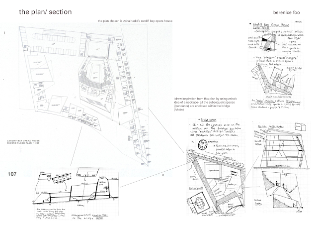
Plan/ Section Sketches - Inspiration from Zaha Hadid
Draft 2 - Plan/ Section
Draft 3 - Form
Moving Elements Draft 2
36 Custom Textures

Miscellaneous 
Marking Schedules


36 CUSTOM TEXTURES - MOVEMENT


Tuesday, May 31, 2016

Moving Elements

Moving Element 1- Study Space


Once the student is inside the study space, they may choose to swing open the partition for additional privacy, especially as the studio/lab space is also used as a bridge between buildings. The partitions are in a triangular shape so that students can easily see if the study space is taken by another student or not. 

Moving Element 2- Window Space

The window slides out to create a private sort of reading room/ study space/meeting space (located in the library/locker bridge above University Mall). I wanted to retain the slim, smooth shape of this bridge, so I decided to create additional spaces which only temporarily jut out. I think I will change the shape once I have a better idea of how my spaces will flow. 


Relation to theory: Elements that the user can engage with, elements that are flexible 

Saturday, May 28, 2016

Development of Model Draft 3- Form

Photos from Lumion
(the spaces i.e. studio, lecture theatres are in the same position as my previous draft)

 Aerial view of the bridge- I retained the layout of the previous draft but changed the form. 
Above university mall. This space will also have lockers and double as a library/ hangout space.

Shape of the studio building. Inside will have studio rooms (top) and computer labs (bottom). 

Open foot bridge between the lecture theatre and main foyer. I found this to be necessary as to not block the view for people driving. 

Slanted entrance to the lecture theatre/s from the bridge over university mall. 

View into building meant for offices/ meeting rooms (rooms not constructed yet). I was thinking of rooms that were both on the floor and ceiling. 

Image of bridge showing offices/meeting rooms (foreground) and studio (background)

Moving elements


The glass roof covering the bridge (library/lockers) over university mall can slide down. As most of my bridge/school is covered, I wanted to create a space that felt more open. This space is more of a community space where students other than architecture students would traverse.


Second moving element will be walls that split into study spaces- like a split pin. This will be inside the studio/computer labs space, creating privacy from people who may be moving through the area to get to other buildings. I will model soon.

Saturday, May 21, 2016

Development of Model Draft 2 - Plan/Section

Outline of Spaces - development in Sketchup with consideration to both draft 1 (perspectives) and plan/section below. I've done my draft planned exterior structure of the rooms, not the interior. 

Red- Entrance/ main foyer/ offices/ meeting rooms 
Orange- Bridge paths. 
Green- Studio spaces
Yellow- Lecture theatre/s
Purple- offices (under the bridge) 
Blue- Library/ study spaces/ chill out spaces 


Moving Components
Lecture theatre can connect to either the squarehouse or the studio spaces. Acts like a "bridge". Sometimes tutorials are straight after the lecture, so depending on where tutorials are located the lecture theatre can be moved for convenience.


Window in the studio space can slide up and down. Normally it would be half-open for ventilation, however some instances such as rain and wind means a fully covered wall is necessary. Bottom half is glass, top half is wood. Issue: large amounts of glazing on the south means that it will get really really cold during the winter- however the view from the spaces above university mall will be horrible if I just block it up.... ....


Images in Lumion
Bridge at night 

Curved walkway over University Mall. Stairs lead to the structure above

Inside one of the spaces in the structure facing the studio spaces

Offices underneath the bridge. Stairs will be implemented. 

Main foyer space etc. 

To do: (24/5/16)

Theory: I want to focus on the phrase in particular "gestures towards engagement" that sort of broadly describes my theory in general. 

- so I want to change my moving element (window) to walls inside the main foyer space on the ground level. At full height they can create spaces for meetings, at half height they can create display benches for a gallery, and at no height the space can be used for events.
I thought of this just then. I will model soon!
- for spaces above university mall- I want to make them more interlocking i.e. corner of one space is used as a table in another space. see functionality of: http://www.archdaily.com/7638/final-wooden-house-sou-fujimoto
Figure purpose for each space and path through - architecture than can be engaged with!
- make some areas of the bridge less "open", and perhaps at different heights. - lockers and shelves can be implemented in these closed in areas! see: http://www.dezeen.com/2016/05/24/home-at-arsenale-slovenian-pavilion-library-dekleva-gregoric-architects-venice-architecture-biennale-2016/. This would be constructed on the sides and above the bridge , with some openings closed for lockers, and some open to allow light and ventilation (not made out of wood)
- make the lecture theatre look better and versatile?